


Morana Cookware Packaging Design
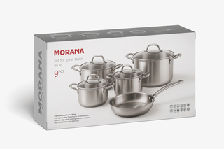
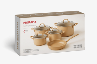
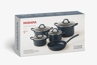
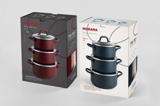
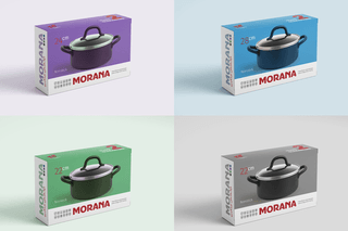
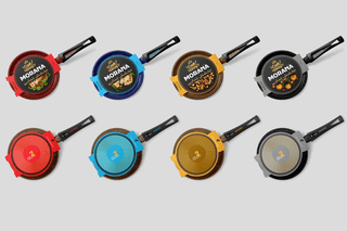
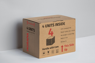
This packaging series was crafted to blend modern aesthetics with functional clarity, ensuring each product stands out on the shelf while communicating its unique features at a glance. The design leverages clean typography, bold product photography, and a strategic use of color coding to differentiate sizes and models. For the stainless steel series, a minimalist approach emphasizes premium quality and durability, using a bright and neutral background to highlight the product’s sleek finish. The colorful cookware and frying pan ranges adopt vibrant, product-matching hues to create strong visual impact and enhance brand recognition. Every element—from the front-facing hero images to the carefully placed icons—was designed to guide the customer’s eye and reinforce Morana’s promise of reliability, style, and performance in the kitchen.